say logo: egg magazine
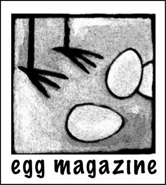
After struggling for months to come up with an appropriate logo for egg magazine , I have finally settled on a design and typeface.
Now comes the hard part: the execution.
Rusty from not using Macromedia Freehand since last summer, I have to re-learn this program and figure out an appropriate colour scheme (if any). I want the graphic element of the logo to look hand-drawn and convey a sense of fun. We writers have a tendency to take ourselves too seriously.
Open to suggestions.
|
|
|
|
|
|
|
|
Comments
I love the idea of having a sense of fun about the whole thing. The only ideas I have for color is maybe to go with colors similar with your blog/site because we are already acquainted with them. But maybe that is just being safe.
Posted by: Megan | May 4, 2007 9:32 AM